
Educational
Why Digital Design is Getting ‘Messy’ Again: The Rise of Tactile & Imperfect UI
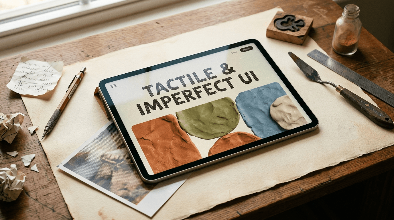
Why Digital Design is Getting ‘Messy’ Again: The Rise of Tactile and Imperfect UI
For over a decade, digital design had a single, undisputed rule: make it clean.
We lived through the era of ultra-flat vector graphics, smooth gradients, flawless 3D renders, and minimalist layouts where every pixel was aligned to a strict grid. Websites looked like sterile operating rooms. App interfaces felt uniform, predictable, and—eventually—completely unmemorable.
Then, generative tools entered the mix. Suddenly, creating mathematically perfect, frictionless graphics took seconds instead of hours.
And that’s precisely when everything flipped.
Today, audiences are experiencing "polish fatigue." When flawless digital imagery is effortless, it ceases to signal quality—it signals automated noise. In response, a powerful counter-movement is taking over modern digital design: the deliberate return of imperfection, tactile textures, and analog warmth.
1. The "Synthetic Fatigue" Factor
When every brand relies on the same sleek design systems and hyper-real renders, visual identity flattens out. Users can intuitively tell when a visual lacks human intent.
Imperfection has become the new signal of authenticity.
Designers are intentionally introducing elements that break the machine-made look:
Film Grain & Noise: Subtle overlay textures that add physical weight to digital canvases.
Organic Line Work: Hand-drawn accents, rough edges, and asymmetrical vector shapes.
Tactile Typography: Typefaces with deliberate ink traps, variable weight inconsistencies, or retro print distortion.
2. From Flat Vector to Physical Materials
Modern UI and web design are moving beyond flat color blocks into visual depth that feels touchable. Instead of abstract minimalism, creators are incorporating materials sourced directly from the physical world:
Parchment, Paper, and Canvas Textures: Giving digital cards and hero sections a grounded, physical backdrop.
Analog Print Effects: Halftone dots, chromatic aberration, and screen-print misalignments.
Spatial & Tangible 3D: Moving away from smooth chrome or glassmorphism toward rougher, clay-like, wood, or fabric-based 3D assets that look like you could reach out and grab them.
3. Why "Messy" Converts Better
This shift isn't just an artistic trend—it’s an attention strategy.
In a feed or search result dominated by ultra-polished, AI-generated visuals, an imperfect, human-crafted design creates an immediate pattern disrupt.
It creates friction (the good kind): A slightly unexpected, tactile layout forces the eye to pause, scan, and digest content rather than scrolling past.
It builds emotional connection: Human beings naturally respond to signals of craftsmanship. Showing the "hand of the maker" builds immediate trust.
It defines a unique brand personality: A brand that embraces intentional design quirks immediately sets itself apart from competitors using off-the-shelf, sterile templates.
Key Takeaway for Creators & Strategists
The goal of modern design is no longer to achieve mechanical perfection. The machine can handle perfection for you.
The real value lies in human direction, intentional flaw, and emotional resonance. Whether you are building 3D assets, shaping a brand identity, or designing web layouts, ask yourself: Where can I bring back the physical world?
An Content from Gemini.......................................